
We all know that charts are the best way of representing the data to the user. In some sites, we may not have the default chart web part in SharePoint. In such cases, we can go for Google api charts. Google api charts are the one which can be used by anyone. Please find the below steps to use Google api charts in your site:
- Download the below files and upload it in Site Assets
- Create a text file(say, MasterChart.txt) and copy the below code into the text file:
<div class="spjs_chartPlaceholder_master"></div>
<script type="text/javascript">
// Set this to true to load the Google Visualization API release candidate
var loadRC = false;
// Set this to true to allow for the use of variables in the "Filter setup textarea"
var allowEval = false;
</script>
<script type="text/javascript" src="/SiteAssets/jquery.min.js"></script>
<script type="text/javascript" src="/SiteAssets/jsapi.js"></script>
<script type="text/javascript" src="/SiteAssets/spjs-charts.js"></script>
- Save the code and upload it in Site Assets.
- Copy the link location of MasterChart.txt
- Go to the page where you have to show your chart
- Edit the page, insert the content editor web part, paste the link copied into “Content Link” in Content Editor web part and click OK.
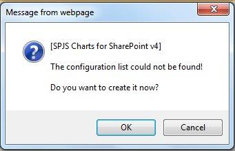
- You will get the below message.Click OK
- Stop editing the page and click on the inverted triangle to fill the chart options and hit Save button.


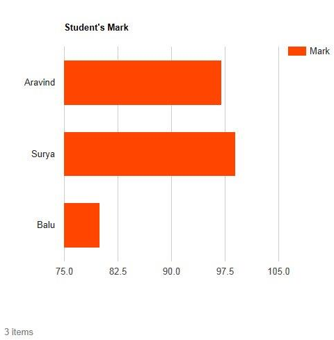
- Chart will be generated as shown below
For more than one chart in the same page:
- If you need to show more than one chart, create a text file(say, SlaveChart.txt), type the below code, save it and upload it in Site Assets.
<div class="spjs_chartPlaceholder"></div>
- Insert any number of content editor web parts depending on the number of charts to be shown and paste the SlaveChart.txt link in “Content Link”. Remember that if you remove the Master Chart, Slave Chart will not work.
Advanced options:
- Options and advanced options in Chart will make your chart more attractive and specific.
- Some of the options to make your chart attractive:
| Chart Type | Option | Value |
| All | title | Quarter II Results (Your Chart Title) |
| Pie charts | is3D | true (converts chart from 2D into 3D and it is applicable only for few chart types) |
| Donut Charts | pieHole | 0.3(any value between 0 and 1) |
| All | legend.position | bottom left in none right top |
| All | legend.alignment | center start end |
| Gauge Chart | min | 0 |
| max | 10 | |
| yellowColor | ‘#FF9900’ | |
| yellowFrom | 0 | |
| yellowTo | 5 |
 |
 |
To create filters for the chart, please follow the below steps:
- Check the box “Use custom CAML”
- Check the box “Create filters above the chart” and select the field from “prefill Textarea from available fields” dropdown
- Then, click on the link “Build CAML from selected filters” and hit save button.

- Chart with drop down at the top will be created. Sample is shown below:

NOTE: Filters might not work when the other chart options like chart type, columns are filled for the first time.
For more details and updates, please refer the original article here
Thanks for reading 🙂
If you liked it, Please rate and comment.

Hello Sathiya. This looks promising for me to use for my company intranet in SharePoint Foundation 2013. However, I have followed your instructions to my knowledge accurately, but I do not receive the Window “Message from Webpage”. Any ideas?
LikeLike
Actually, just figured it out! The third line of your text file needs to be changed as the src=”/SiteAssets/spjs-charts.js” should be src=”/SiteAssets/spjs-charts-v4.js”. This is wonderful!
LikeLike
Not getting the Window “Message from Webpage”. Followed Ryan’s suggestion also.
LikeLike
Hi Ravikant,
Please make sure you replace the src attribute of script tag in MasterChart.txt to the exact path of the files in sharepoint(spjs, jsapi, jquery). If so, please check if configuration list is created in site contents.
LikeLike